 Allon Prooit
4 years ago
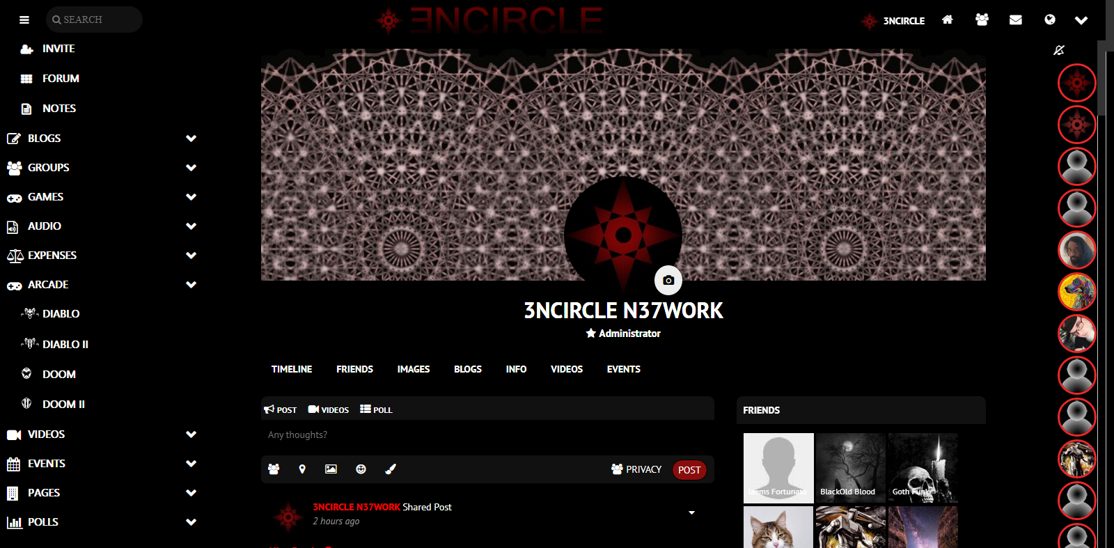
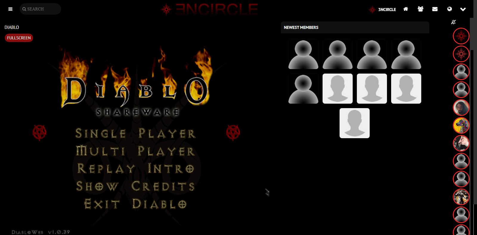
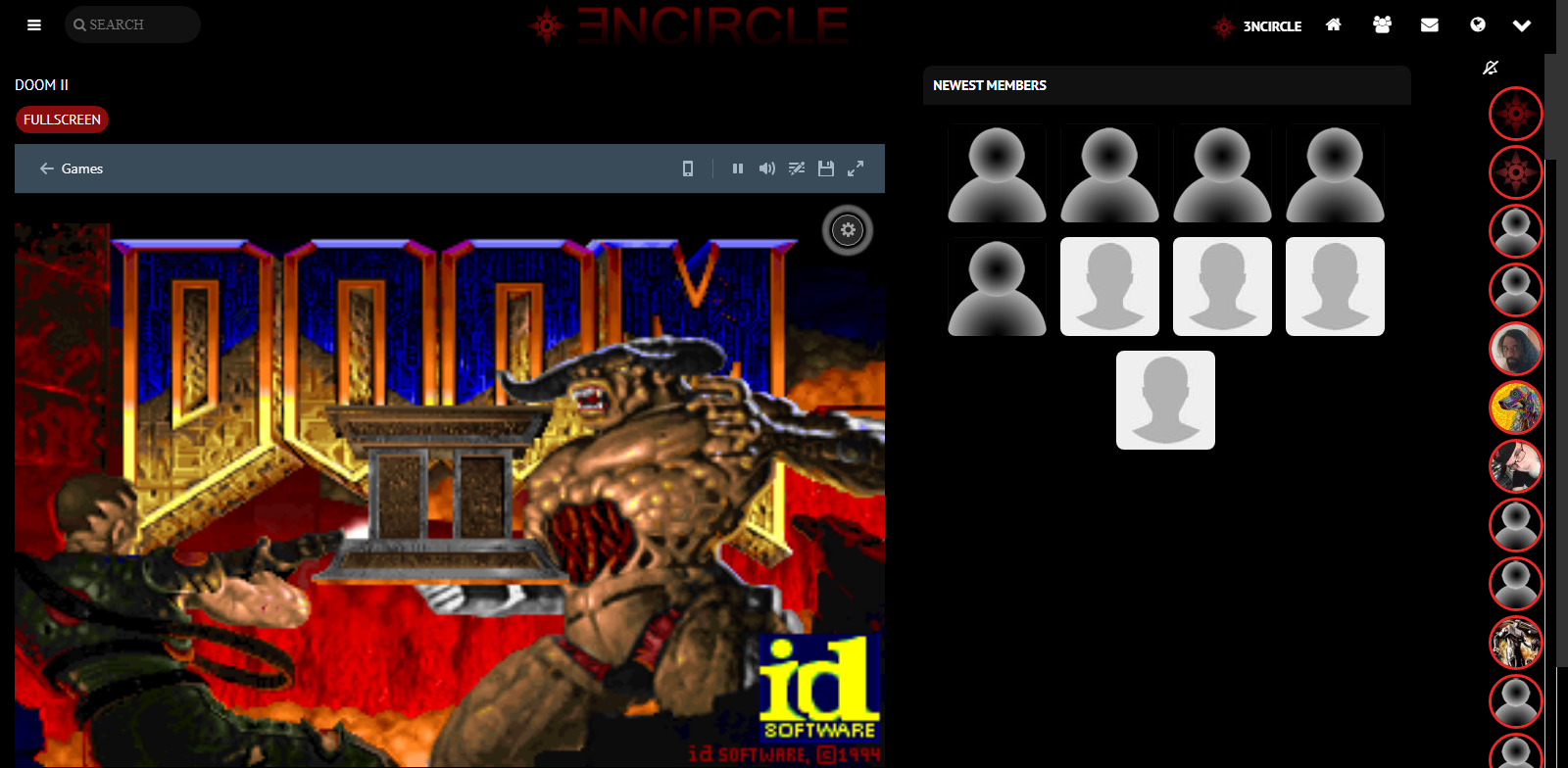
This component is a basic rewrite of the original "games" component. It features DIABLO, DOOM II, and a dosbox interface that gives you numerous other games. You can easily modify it to feature other games that you can embed by changing the arcade.php file to link to them.
v1.0 - Includes Diablo, Doom II, and a link to DosBox games.
v1.1 - Added a full screen button for Diablo.
v1.2 - Complete rewrite. Made two separate pages for Diablo and Doom II (with DosBox). Full screen buttons for both games now. Installs an Arcade menu item with a submenu for the games. Easily change out the games and code for even more games in the arcade with this easy to edit and use component!
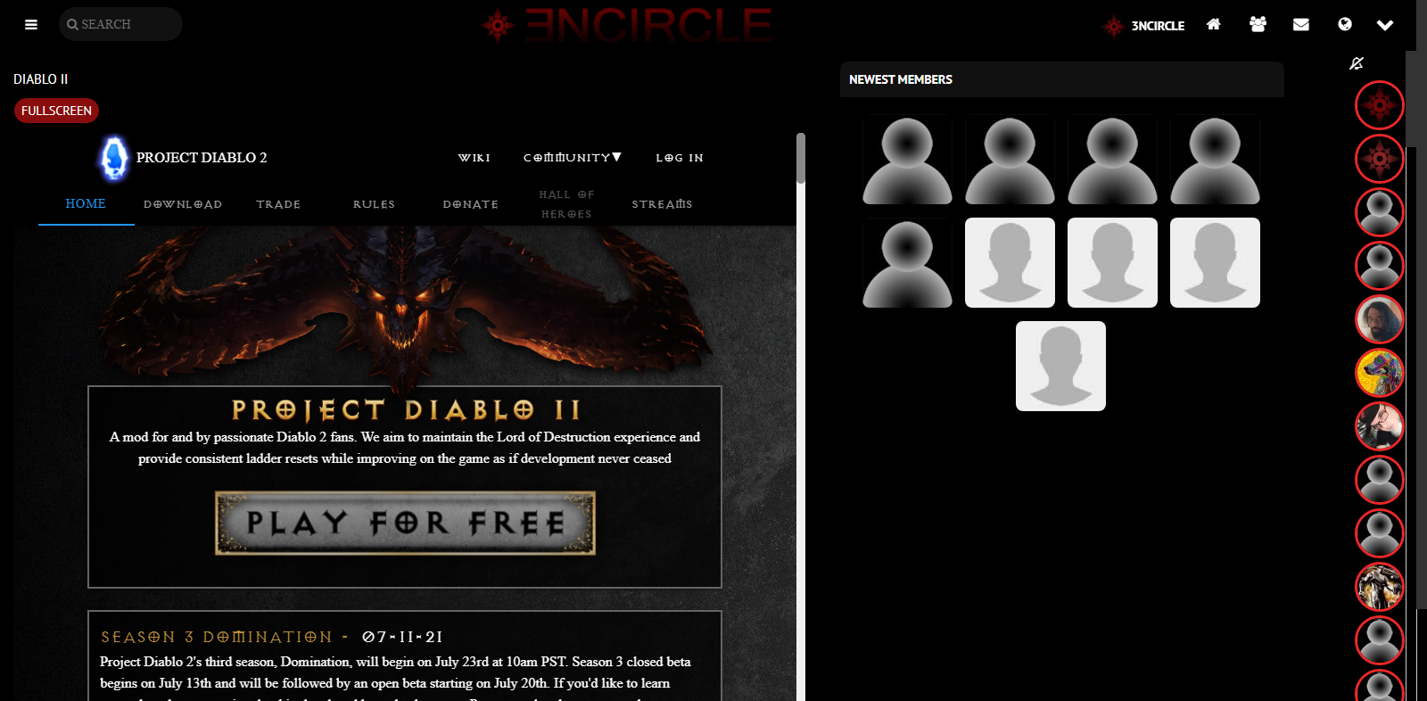
v1.3 - Added a 3rd game port to Diablo 2! Game only works on desktop and requires present or previous Diablo 2 purchase.
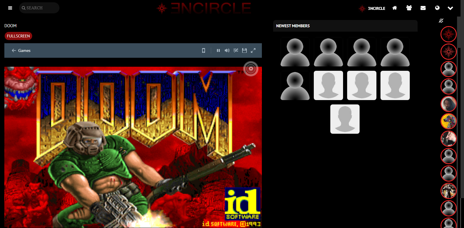
v1.4 - Added a 4th game to the line up, the original DOOM!!! Plus, altered the code so that Doom and Doom II are now mobile friendly.
v1.5 - Removed exorbitant code and added special icons for the games.
v1.6 - Added Duke Nukem, Wolfenstein, The Legend of Zelda, and Sonic the Hedgehog to the games roster!
 TheDoggyBrad Software Lab
Replied 2 years ago
Just a mod that makes all of the contents of this component moved to the games folder instead of the arcade folder.
Source Code:
https://github.com/thedoggybrad/thedoggybrad/tree/main/experiments/arcade-1-6/Arcade
No Download Links or Zip files will be provided.
 Joseph Gatt
Replied 3 years ago
Hi! There is one small issue, albeit a minor one @Allon Prooit. When the user clicks on the "Full screen", the result is two distinct and separate game screens, namely the Full screen one (which loads from scratch), whilst the prior screen game keeps going. The user then has to manually pause the prior screen game (or else change tab), such that, at the very least, there will not be two distinct sound scores audibly interfering with each other. Ideally, when the user clicks on the "Full screen", the initial game screen is closed/paused. Nonetheless, all in all this is a very nice and interesting component. Well done @Allon Prooit.
 Joseph Gatt
Replied 4 years ago
The edited version worked like a charm @Allon Prooit. Thank you for your kind help.
 Allon Prooit
Replied 4 years ago
@Joseph Gatt - Sorry about that. I just uploaded an edited version that changes class="container" to class="icontainer" to avoid the system override this was causing. Let me know if this fixes the problem for you.
 Joseph Gatt
Replied 4 years ago
Post-script: However, for some reason, the new coding is messing the platform's layout. Whilst the layout is ok whilst the game itself is in play, I discovered that problems then mysteriously crop up afterwards. For example, on clicking the tab "Photos", you get a lot of white space on top. Also, in the welcome screen (i.e. before logging in into the platform), you also get a huge amount of white space, such that you have scroll down sharply in order to get to the logging interface. Because of these unexpected problems, I had to disable the component again, and now the layout is back in its original good shape.
 Joseph Gatt
Replied 4 years ago
Super! Many thanks @Allon Prooit !
It looks much better now.
 Allon Prooit
Replied 4 years ago
@Arsalan - Many thanks for the suggestion. I was able to find advice at W3 Schools on how to do this. I altered the code for v1.5 some based on this. Now the iframes are responsive. Too small to work really well with mobile but, that's what the fullscreen buttons are for.
@Joseph - This should hopefully fix your problems with overlap. Check out W3 Schools for more ratios!
 Arsalan Shah
Replied 4 years ago
The problem seems is most of iframes in this component set the default height and width example
width="888" height="666"
Now this creates serious problem with responsive layouts. @Allon you may can search for responsive css iframes. I tried to find some references but there are couples so you can find on google that fits the need.
 Joseph Gatt
Replied 4 years ago
This is a very nice retro component.
Unfortunately, there is a snag. The game window is not sizing correctly, and the right portion of the game window is unfortunately covered with other components. (For the record, my display resolution is 1360 x 768.) I could send a screenshot, but it does not appear that this is technically possible within this thread.
 Allon Prooit
Replied 4 years ago
Many thanks ~Z~ Man. I took your advice and shortened it some to get the special icons to show. Here's the code...
.menu-section-item-diablo:before {
content: url(<?php echo ossn_site_url('components/Arcade/images/diablo.png');?>) !important;}
Now I need to make some small adjustments to the icon placement to make it perfect! Any thoughts?