 Ranjan Rai
Posted in General Discussion 5 years ago
It doesn't look good wile visiting the friends and Photos section as a login user to view the friend list and Photos, it appears like looking at somebody else profile page, with the introduction of the separate pages for the friend list and Photos will eliminate this feeling.
Similarly a sub-page for blog can be a good, it can render all the blogs information from the profile page.
 Ranjan Rai
Replied 5 years ago
When we accese
mysite/u/bernhard/friends
we have a display with no sidebar's it is okay for the other members to have this view, but if we have a different url structure such as
mysite/friends/all
accessible from the left sidebar obeying the column structure so that a sidebar can be accommodated in the friend page, this gives a felling of separate page.
Same thing applied to the photos.
Where as for blogs a sub-page
mysite/u/bernhard/blogs
can render all the blogs posting by bernhard on the profile page, instead of taking a different url such as
mysite/blog/member_blogs/1
which is already having a sidebar.
So having different url structure can provide a different feeling on different pages.
 Michael Zülsdorff
Replied 5 years ago
Sorry, but I don't get want you mean:
When I'm looking at a page like mysite/u/bernhard/friends
I DO see only bernhard's friends. So where's the confusion?
Same with mysite/u/bernhard/photos ....
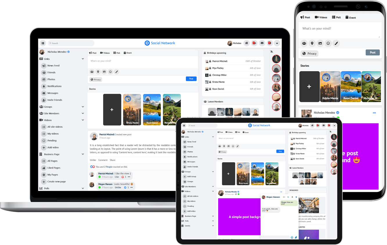
Due to the many requests in the past for additonal features and components we have decided to develope a premium version. Features like Hashtags, Videos, Polls, Events, Stories, Link Preview, etc included in it.
 $199 (Life Time)