 Philip Lozier
Posted in Technical Support 4 years ago
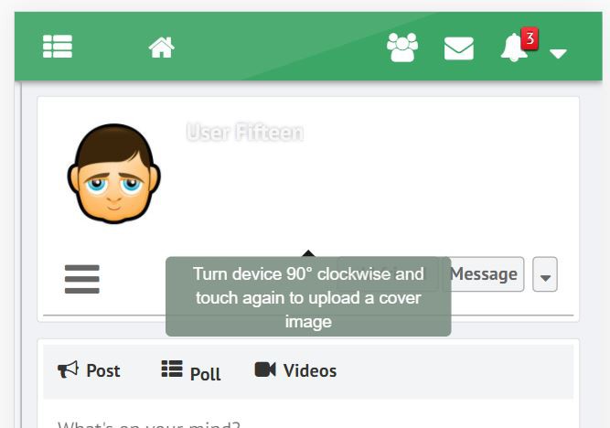
Noticed very few mobile users are uploading cover photos, even though they might include a profile photo. Why? Because they don't know how. There is no option that shows for mobile users.
I know the response has been given in another message that they need to turn their phone sideways, but... how is a user supposed to know that, (?) and WHO turns their phone sideways on a social network unless they play a game or something that prompts them to do it? That kind of thinking that mobile options are not that important is not good for the future, or even NOW, for that matter.
I think that a plain, in their face, method needs to be added to the profile component. As I have stated in a post or two before... it is a MOBILE world now. 85% of people access the internet from their mobile devices, and out of that 85% of them will ONLY do it via apps, unless an app they're in takes them out via an external link. These are the statistics, and that is the trend, overwhelmingly. Look up the stats and trends for yourself, developers. Whole social networks are being created that have NO desktop interface, and without an app you can't even use it. Me, I prefer the desktop side while I am at home, but I am old, and that is what I'm used to. That is not the case in the real world, today.
Is it possible that a method that is user friendly, and obvious, be implemented in the (hopefully very) near future? Is it also possible that any component development, in house OR third party, be approached with the reality that MOBILE FIRST has to be the design template for the future for any web applications to survive?
Regards,
Phil
 Philip Lozier
Replied 4 years ago
A tool tip would be absolutely helpful. That would be great. perfect. I have currently put a note using the "announcement" component so it shows up near the top of the news feed, but was hoping to avoid having to leave a permanent announcement and save that feature only for important things. A tool tip would replace that, and would be great.
Another thought is, if there could be options "upload profile photo" and "upload cover photo" as a menu item in the "edit profile" menu. After uploading a cover photo, a pop up could tell the user (if on mobile) "rotate phone to reposition cover photo"... (???) ... maybe? An "edit profile" button that shows on a users profile (if it's their profile) would also be an improvement. Users are spoiled these days and don't really know how to "look" for things, nor do they want to bother. I am currently looking to also put the "edit profile" back under the users name in the top of sidebar in your greenbygreen. I tried it once before and it didn't work (not a coder) and put it on the back burner, but now with paid promotion for my site I need to pay attention to these little details now that it is up. These aren't complaints... just ideas to make the whole experience more user friendly, overall, and hopefully have a higher user retention rate.
Regards,
 Michael Zülsdorff
Replied 4 years ago
Philip,
as for the 'mobile first' part I agree completely.
Actually, it wouldn't be too difficult to display the necessary buttons in portrait mode.
The pain starts with dragging/positioning the image in that narrow area, and even more to find the right cropping region to make the image look nice and the same way on larger screens, too.
That's why it's recommended doing that on a PC if possible.
Again, I'm with you that turning the device 90° clockwise isn't really obvious, that's why I'm thinking of displaying at least a tooltip with the next GreenByGreen release like ...

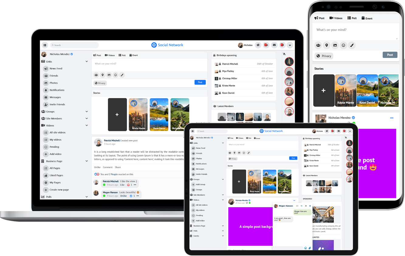
Due to the many requests in the past for additonal features and components we have decided to develope a premium version. Features like Hashtags, Videos, Polls, Events, Stories, Link Preview, etc included in it.
 $199 (Life Time)