 William Shoap
Posted in General Discussion 4 years ago
When posting a reply to a comment, there needs to be a button visible that the user presses to save the comment. Currently, the user must figure out that the return key on the mobile phone or the enter button on a normal keyboard must be used to save the comment. It is not intuitive yet.
 William Shoap
Replied 4 years ago
If I could get this theme to look like the "White" theme that comes with Premium, I would use it. I need that paperairplane.
 Michael Zülsdorff
Replied 4 years ago
I like Prashant's idea of clearing the right toolbar drop-down menu from items that are rarely used
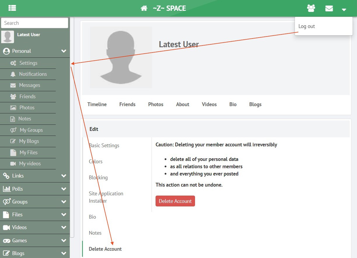
It's implemented in GreenByGreen 2.4 like this now:

 Philip Lozier
Replied 4 years ago
@Arsalan Shah ... oops... wrong topic on the last comment, but still something I had brought up elsewhere before.
 Philip Lozier
Replied 4 years ago
@Arsalan Shah ... There most certainly IS a "reply"to comment feature. Image below, comment by Jax Collins, just to the right of the "like". When this is selected it creates another comment, in a sub-thread, with the person who posted the original comment's name highlighted, as can be seen in the comment of Simone, below, back to Jax Collins. It highlights it like mentions UI, EXCEPT that is does NOT matter if the person is on your friends list, or not. It also sends a notification to the user who is highlighted -only-, not to everybody else participating. I also agree with the wish list of Prashant Kumar on -some- suggested items... groups, the delete account, better search, time zone fixes (really, really, bad now), stories, ... well... actually all of them. These are pretty much "basic" features on 99.9% of social networks now.

Regards,
 Prashant Kumar
Replied 4 years ago
I am a premium OSSN user and wish if the following points could be considered by OSSN team:
1. Reply to comment features with the option of stickers or GIFs.
2. Account delete option should not right below log out, it should be in the settings menu with additional features like Deactivate.
3. Live Video is now a very popular feature in another app, it can be added.
4. Not able to search page/group by name, more features for group/pages required.
5. Direct video/audio call from Message Box, better-redesigned message box with more features, stickers/gif options and profile name lick should direct to profile page.
6. TimeZone should be country wise to search easily, as of now it's with the continent where we find it difficult to find our country or zone.
7. New menu for privacy, terms & conditions, feedback/reporting and help etc in topbar dropdown menu.
8. Story could be better
9. Upcoming Birthday shows even passed birthday and also upcoming in more than a month.
10. More colours, design/texture in post background with feeling with additional features.
Thanks to Arsanal Shah for adding so many useful components, wish you to add more useful components to make ossn smother and more user-friendly with all required features.
 William Shoap
Replied 4 years ago
Yes, Z-man, your video demonstrates what I am trying to communicate perfectly. Arsalan, this function appears in the mobile app version of Facebook. It is an excellent function to have and will prevent people from double posting the comment when there is latency. I have noticed several users hitting the return button more than once when the page is slow and all the sudden you see two or three duplicates of their comment to a post. It would work just fine in the normal web version as Z-man has demonstrated, but facebook did not put it there yet. I am using the white theme and was hoping this could be an improvement.
 Arsalan Shah
Replied 4 years ago
I am also facebook user I don't see any comment button to reply, all comments are posted when pressing Enter Key, And SHIFT+Enter gives new line

Are you sure you are using facebook.com ?
 Michael Zülsdorff
Replied 4 years ago
It's soooo different ... it's like
https://greenbygreen.z-mans.net/d4852/paperplane-comments
 William Shoap
Replied 4 years ago
I put in a request to see if this can be incorporated. My users are getting confused because they are used to Facebook. What I am finding is they hit the return key on their device keyboard more than once causing double posts. Having a button like this may alleviate this issue. It really needs to be a standard in all themes I think. How has your experience been with your implementation of the paper airplane?
 William Shoap
Replied 4 years ago
Where can I download the latest green by green release?
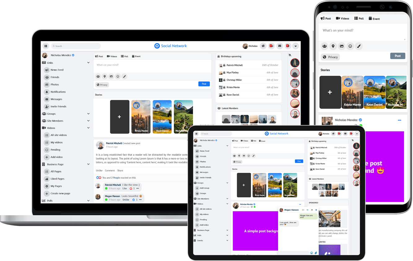
Due to the many requests in the past for additonal features and components we have decided to develope a premium version. Features like Hashtags, Videos, Polls, Events, Stories, Link Preview, etc included in it.
 $199 (Life Time)