 Allon Prooit
Posted in Theme Development 3 years ago
I keep having an issue with the main top image resizing in mobile and on desktop differently. The desktop shows it fine but the mobile one is squeezed some and off to the left.


Surely it's just a coding error or something. Any thoughts?
This is from my site the 3NCIRCLE N37WORK
 Michieal ~ Coder ~
Replied 3 years ago
Inspect the element to see which css class it's using. Find that class, and then look for a @media {} and look for the the tag inside of one of those. If the element does not exist, then it's using the main class definition. In that case, find the @Media{} block for the size screen for phones, and set up special properties there for it.
(Such as padding, margins, etc.)
-Michieal.
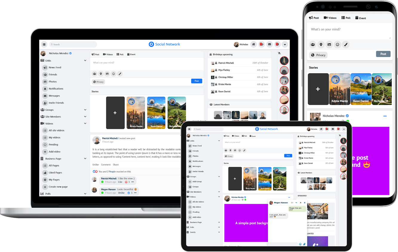
Due to the many requests in the past for additonal features and components we have decided to develope a premium version. Features like Hashtags, Videos, Polls, Events, Stories, Link Preview, etc included in it.
 $199 (Life Time)