 andre kutzner
4 years ago

A little game find because there are always 15 icons to find because of the background it is getting harder and harder I only tested it on GreenByGreen because I have a different theme I hope you like it more games are available on my HP.
translated by https://www.deepl.com/
Changes
V 1.2 small bugs removed and adapted to GoBlue 5.2
 Michael Zülsdorff
Replied 4 years ago
Much better, now!
Still some small glitches:
1. 'icon' => $icon makes no sense, as long as $icon is undefined. So better remove that line.
2. <img src="./he1.jpg" height="450px" width="340px" gives an error because he1.jpg is not included
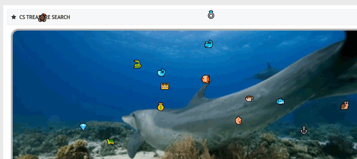
3. Sometimes one or more treasures appear outside of the gif background like

4. In case you're not the vendor of the game, you should add a credits file with name of and link to the vendor
 Andre kutzner
Replied 4 years ago
i think i need your help z will then upload nothing more no matter how i do it go blue air green by grren no please help
 Michael Zülsdorff
Replied 4 years ago
Fine, it's working for YOU, Andre ...
but you can't expect anyone else running your premium champstyle theme.
Any component released here should be at least compatible with Ossn's free default theme Goblue.
 Andre kutzner
Replied 4 years ago
With me on the side it goes therefore I cannot follow you www.champstyle.de

 Michael Zülsdorff
Replied 4 years ago
Ok, the javascript issue has been fixed now,
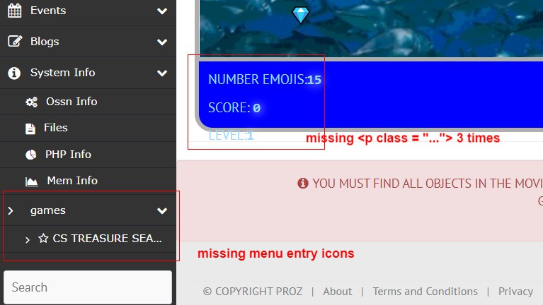
but still no menu icons and too large line spacing
and unfixed 'icon' => $icon, line in com file.
I mean: there's not any declaration of $icon, so how is that meant to work then?

 Andre kutzner
Replied 4 years ago
i will revise it the days z man i have found the error already but thanks
 Michael Zülsdorff
Replied 4 years ago
Release 1.1 doesn't work anymore because
<span class = 'gamesschatzspan' class="leftEmojis"></span>
is causing javascript errors. (a HTML tag can't have 2 separate class defines)
Next: the three paragraphs inside the scores div are missing the 'gameschatzspan' class.
Finally: the games menu entry is still unfixed and ugly. And what about 'icon' => $icon, ?
 Michael Zülsdorff
Replied 4 years ago
Yo, a funny new game, thank you Andre!
But I'm not really happy with the implementation, though.
Starting with the css part:
div,
p,
span {
    box-sizing: border-box;
    margin: 0;
    padding: 0;
}
.container {
    position: relative;
}
You have to be aware, that the css rules of any component are merged with your complete site's css!
Thus, re-defining basic elements - just because your component needs them this way - is not a good idea, because it will have a site wide impact.
In other words: If your component really needs a <p> with different attributes, leave the <p> as is and add a class to it instead like <p class = 'gamesclass'>
Next: <body bgcolor="lightblue">
What's that?
The HTML spec allows exactly one body element - and this is already provided by the theme in the beginning of your site.
Having another one here is invalid.
Finally: the games menu entry '**> ***' looks a little strange
 Evindu Shavinda
Replied 4 years ago
Nice component