 Philip Lozier
Posted in General Discussion 4 years ago
Suggestion for the search bar for the next release:
I have had a few members send me messages asking why the searchbar doesn't work, (mostly mobile), and I have had to instruct them to use the enter key on their on screen keyboards.
The same as the paper plane icon that ~Z~ man has added to the comment section in his Green by Green theme, a magnifying glass icon in the right side of the search bar that sends a return code is sorely needed. I would hope I am looking forward to this in the next version release of OSSN :)
Regards,
 Green Dragon Tavern
Replied 3 years ago
Use your Green machine here, so bring it on! Look forward to update as I have already teased our community :-)
 Michael Zülsdorff
Replied 3 years ago
It will be part of the GbG, as there are too many dependencies in terms of anchoring and logic that a component could only fulfill with great effort. Programmatically fading out the original layout first and replacing it with a different one wouldn't make things any faster, by the way. ;)
 Green Dragon Tavern
Replied 3 years ago
~Z~ Man, would this be an update to Green, or a new single component? Thanks again for all.
 Green Dragon Tavern
Replied 4 years ago
Spot on, that works! Release that puppy :-) You have made a weak point a strength in OSSN...you're hired! Excellent work ~Z~ Man and appreciate the attention to detail.
 Michael Zülsdorff
Replied 4 years ago
Okay, I managed to place that additional icon on the top bar. It's tested to work with older devices down to 320px of width. Result types appear in line. Depending on the string length 3 to 4 entries should be possible per line - further ones will float to the next line.

 Green Dragon Tavern
Replied 4 years ago
Agree with your Drawback, although we have 7 to choose from, you're showing 2 on phone. Screen real estate since almost all use phone is critical, and based on Green theme, you get it.
You have an eloquent solution that should be THE OSSN search. A suggestion, if possible, put search icon on TopBar, there's room and it's one click from anywhere. Did notice TopBar only had Menu while searching, a restriction in OSSN?
You do really good work, excited about potential, and thank you.
 Michael Zülsdorff
Replied 4 years ago
Possible, yes. Drawback: It would need an extra click to open that popup. Perhaps a simple inline layout would do ...

 Green Dragon Tavern
Replied 4 years ago
~Z~ Man, very close indeed, excellent. Does RESULT TYPE have to be that option box format or can it be a simple drop down list to save space?
 Michael Zülsdorff
Replied 4 years ago
Thank you very much for your suggestions, GreenTavern.
In fact, your idea can't be implemented 1:1 without touching the core search function, so I was trying a little different approach which comes close to yours.
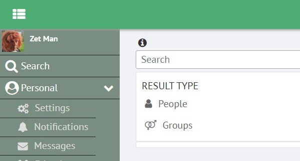
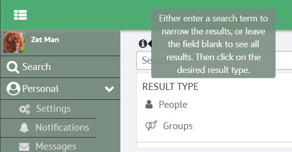
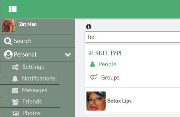
In opposite to the former logic, now your search term stays in place. So you may either enter some more characters and/or use the same query for groups or other result types
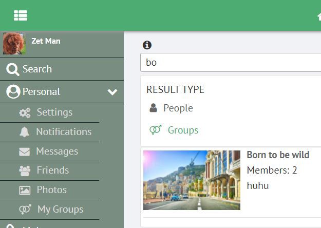
All in all you don't have to switch between menu and result page anymore - you'll stay on the same page all the time.
 Green Dragon Tavern
Replied 4 years ago
~Z~ Man, you are definitely the go to here :-) Let me ask if this is even possible.
Main search: A simple combo box ie, a text box with an attached list box. Excellent for history (set a limit to display) of your search. The default is always real name or username, however you got it setup in OSSN. If you leave text box blank and search it takes you to result page but doesn't search for anything.
Search result page;
Should have a drop-down list box, it's static data, contains all that can be searched (Username, Real Name, Groups, Blogs, Online etc). Below that is the same simple combo box noted above. This gives you one stop shopping for searching OSSN, very flexible, smaller foot print and ability to stay in one place until desired result.
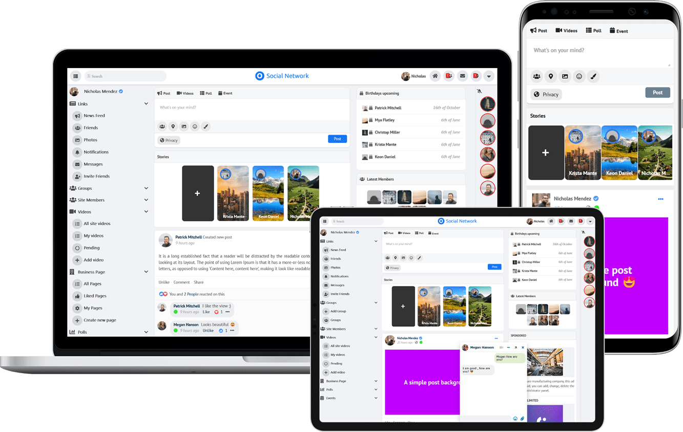
Due to the many requests in the past for additonal features and components we have decided to develope a premium version. Features like Hashtags, Videos, Polls, Events, Stories, Link Preview, etc included in it.
 $199 (Life Time)