 Arsalan Shah
Posted in General Discussion 2 years ago
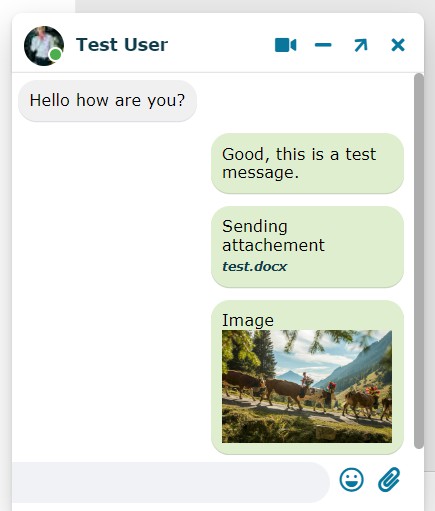
What do you think about the new layout? you will be able to send files, and photos inside chat.
 MAURICE TAYLOR
Replied 2 years ago
will I have to upgrade to the ossn to achieve this?
 MAURICE TAYLOR
Replied 2 years ago
I been waiting :) when is this coming ?
 Dominik L
Replied 2 years ago
When are these changes coming?
 Michael Zülsdorff
Replied 2 years ago
Many thanks!
 Arsalan Shah
Replied 2 years ago
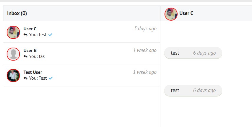
I understand, with the new changes on github themes can show in border this way
.ossn-inmessage-status-circle {
    display:none;
}
.ossn-inmessage-status-offline .user-icon-smaller,
.ossn-recent-message-status-offline .user-icon-smaller {
    border:1px solid red;
}

.ossn-inmessage-status-online .user-icon-smaller,
.ossn-recent-message-status-online .user-icon-smaller {
    border:1px solid green;
}
I hope it helps now :)
 Michael Zülsdorff
Replied 2 years ago
Yes, that's what I was talking about, Arsalan. Because I want to stay with Ossn's original way of marking online members with a green border around the image. I don't see any sense in cropping the faces of the users in general and now even messing up the remaining visible part with colored dots, why?!
 Arsalan Shah
Replied 2 years ago
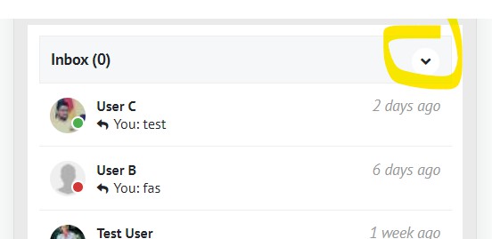
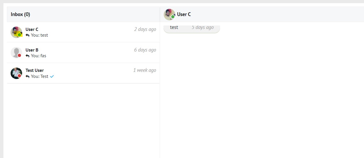
currently I may set this new ossn-inmessage-status-circle to display: none in my theme, but there's no class to mark the image some other way
You mean online/offline status?
 Arsalan Shah
Replied 2 years ago
 Arsalan Shah
Replied 2 years ago
Need to find a way to show recent members online status. I wanted to use less ajax requests so maybe we can utilize existing request of opened chat window?
 Michael Zülsdorff
Replied 2 years ago
What I like:
- file attachments
What I still miss:
- a way to see instantly who of my friends is on or offline in general (left column)
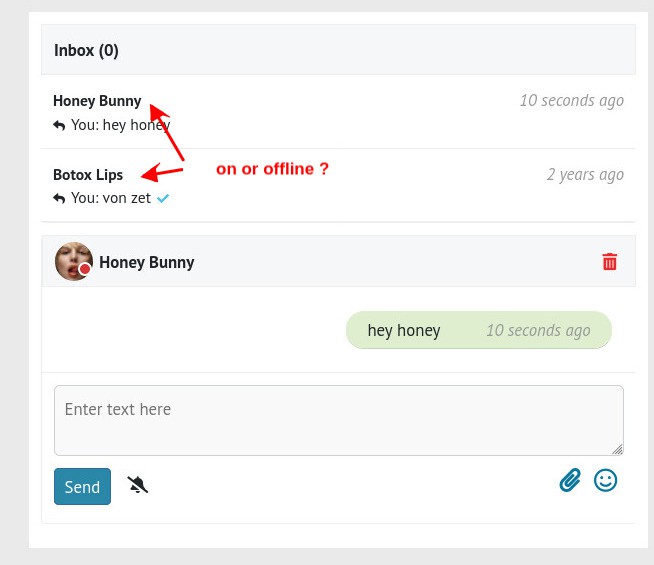
What needs to be improved
- on / offline marking in mobile view if no member avatar is available
- theme independent marking of member avatars
currently I may set this new ossn-inmessage-status-circle to display: none in my theme, but there's no class to mark the image some other way
Due to the many requests in the past for additonal features and components we have decided to develope a premium version. Features like Hashtags, Videos, Polls, Events, Stories, Link Preview, etc included in it.
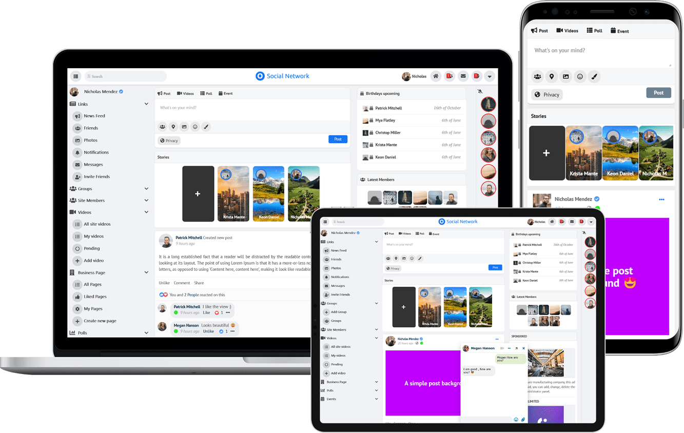 $199 (Life Time)