 Mick Dawlings
Posted in Technical Support 1 year ago
I want to add custom text in the sign up page and include <br /> and other html for example.
This seems to work on the top but it shows broken in the green bar below.
Could I remove the green bar so that my top text is not redundant and broken at the bottom?
 Arsalan Shah
Replied 1 year ago
You can replace the content of your file helloworld/newindex.php with anything you wish
 Mick Dawlings
Replied 1 year ago
What I basically want is the goblue signup/login page but using the white theme.
 Mick Dawlings
Replied 1 year ago
Thanks for this information Arsalan.
I like how many things are possible with the core package.
 Arsalan Shah
Replied 1 year ago
Since themes have high priority so you can not override by just copying pasting. You need to do it via hook by adding it into your component init function ossn_hello_world . First create a file plugins/default/helloworld/newindex.php and override the default theme index using below hook.
ossn_add_hook('halt', "view:themes/white/plugins/default/pages/contents/index", function(){
                return ossn_plugin_view('helloworld/newindex');
});
Note that the hook is not required if theme is not overriding default file. You can override in that case just copy plugins/default/pages/contents/index.php into components/HelloWorld/plugins/default/pages/contents/index.php
 Mick Dawlings
Replied 1 year ago
Hi,
So I'm able to change the signup form section using this input but the rest of the page looks the same of course.
To change the full page, would I just need to copy the other files also such as login and login2?
I would like to reposition the large image, the form, things like that.
 Mick Dawlings
Replied 1 year ago
Thank you. I'll give that a try.
 Arsalan Shah
Replied 1 year ago
You can simply override the signup form with your own custom form.
Copy system\plugins\default\forms\signup.php to components\HelloWorld\plugins\default\forms\signup.php
Making sure cache is disabled. Once done edit the form in new place that is all you may change button text, add new stuff inside it.
@Micahel, it will just create another duplicate string, however its very rare case that someone like to edit the text. In such a case above solution would be best to simply override the form and change button element / text to different.
 Mick Dawlings
Replied 1 year ago
@Michael, true but I figured I would put one somewhere else using html.
The login page is where I would want the most control of all for html so I can make it look as much like I want/need as possible.
There is very little I can do to my a site look unique the way things are now.
The question at this point is why does the same text show up at the top and in the green bar?
 Michael Zülsdorff
Replied 1 year ago
Well,
the part I am missing is: Which way do want new members to register if there's no longer a button to submit their data?
Aside from that I think it makes sense to have a separate create:account:button language string with the next release in order to avoid issues like that.
 Mick Dawlings
Replied 1 year ago
Ok, just wanted to make sure I didn't miss anything. Thanks again.
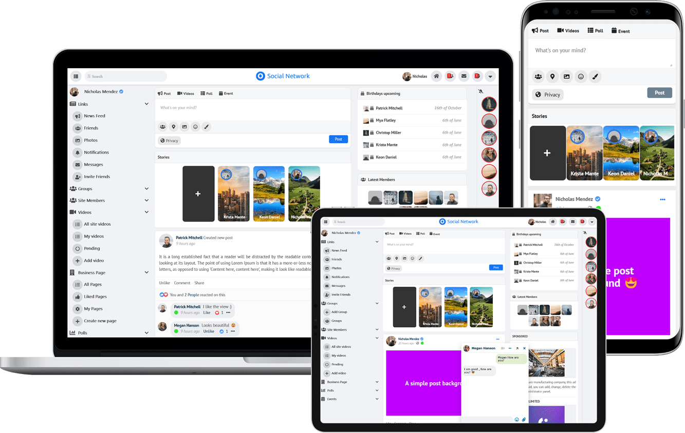
Due to the many requests in the past for additonal features and components we have decided to develope a premium version. Features like Hashtags, Videos, Polls, Events, Stories, Link Preview, etc included in it.
 $199 (Life Time)